
Quick answer: Readability and typography describe how easily people can understand written content and how its visual presentation supports reading. Clear language, useful paragraph breaks, legible typefaces, comfortable spacing, and sufficient contrast work together. For SEO, prioritize helping readers understand and use the page rather than chasing a particular font or readability score.
Key facts
- Google recommends clear, organized content without prescribing a sentence count for paragraphs. Search Engine Optimization (SEO) Starter Guide
- WCAG AA text contrast minimums are 4.5:1 for ordinary text and 3:1 for qualifying large text, with exceptions. Understanding Success Criterion 1.4.3: Contrast (Minimum)
- WCAG AA requires text enlargement to 200% without losing content or functionality, except for captions and images of text. Understanding Success Criterion 1.4.4: Resize Text
- Unitless CSS line-height values keep line spacing proportional to font size. Typography
TL;DR: Make text easy to understand and comfortably readable, then test the actual page across screen sizes, zoom settings, and reader tasks.
- Readability
- How easily an intended audience can read and understand a passage, influenced by language, structure, and presentation.
- Legibility
- How easily readers can distinguish individual letters and words in a particular typeface and display setting.
- Typography
- The selection and arrangement of type, including size, weight, spacing, alignment, and hierarchy.
- Measure
- The width of a text block, often discussed as the approximate number of characters per line.
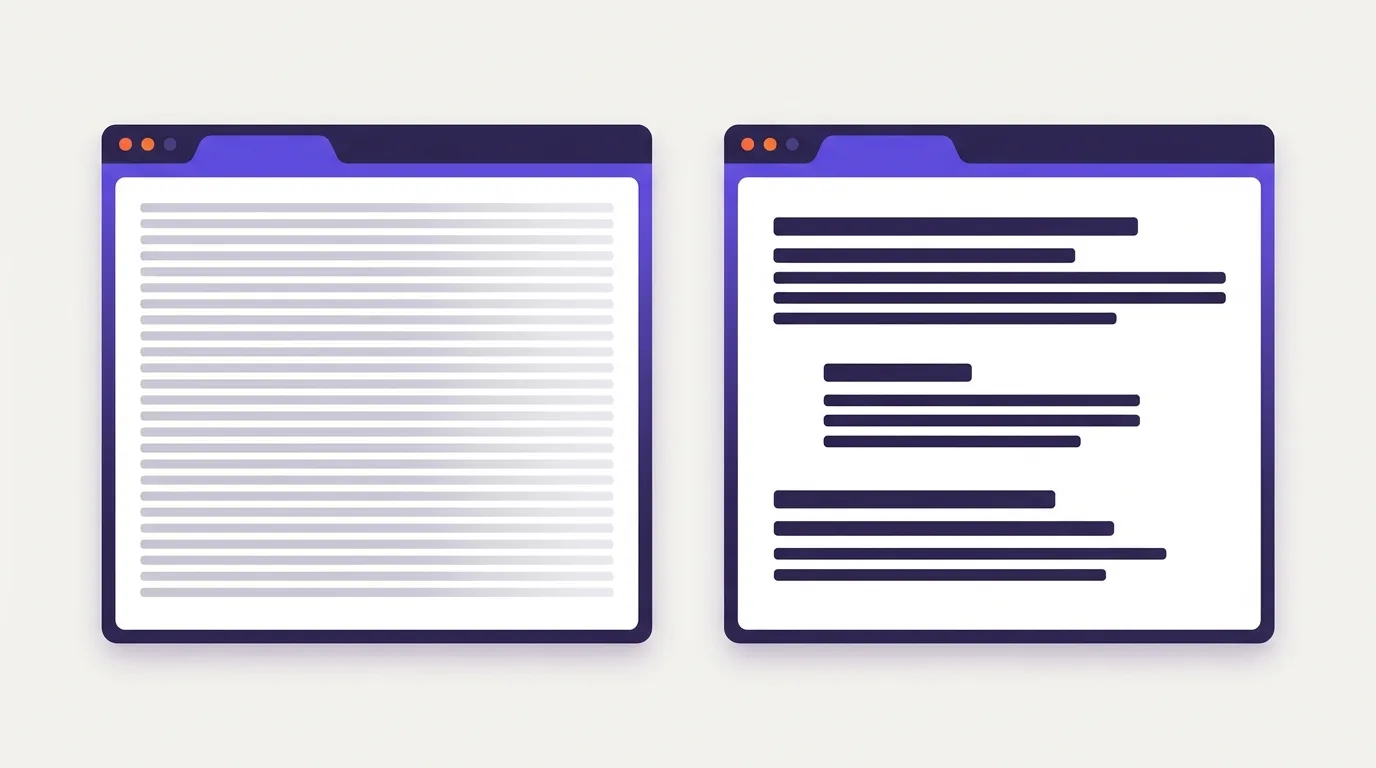
What are readability and typography?
Readability and typography shape how easily people read and understand a page. Readability is about making sense of the text. Legibility is about telling letters and words apart. Typography is how you arrange the type on a page. Good spacing can make text easier to follow, but it can’t fix unclear wording.
Say a reader loses their place in a long paragraph. A clearer font may not solve the problem. Try a narrower text column, or split the paragraph where the idea changes. Make headings stand out so readers can see where each topic starts.
Clearer wording is not the same as clearer presentation
Wording changes help readers grasp the meaning. Design changes help them see and follow it.
Before: “Verification of all details is required before submission.”
Clearer wording: “Check that all details are correct before you submit.”
Clearer presentation: Keep the revised wording, but give it its own paragraph with enough space around it.
These checks focus on the text and how it appears on the page. They aren’t a full check of your content strategy or access needs.
For broader editorial improvements, see content optimization, which looks at how well a page serves its readers and purpose.
Why does readable text matter for SEO?
Readable text matters for SEO because people need to understand and use what your page says. Dense wording makes useful advice harder to act on. Google recommends clear, well-organized content in its SEO Starter Guide.
Readers shouldn’t have to untangle a sentence or search a wall of text to find an answer. Clear wording reduces that effort. Headings help them find the part they need.
That doesn’t make a font or readability score a documented standalone Google ranking factor. Choose type and wording to suit the reader’s task, not an assumed ranking signal. A score can flag a hard passage, but it can’t tell you whether someone understands a technical term.
Treat better understanding as an outcome to test, not a promise of higher rankings or more sales. Ask readers to explain the main point or complete the task. Use user engagement metrics as supporting evidence. They need context and don’t prove that someone understood the page.
Make passages clear and easy to scan
Use words your readers know. Give each paragraph a clear focus, with breaks where the topic changes.
- Choose direct language. Replace “utilize this checklist” with “use this checklist.” Keep technical terms your readers need, but explain unfamiliar terms when you first use them.
- Group sentences by meaning. Start a new paragraph when the idea changes, not when you reach a fixed sentence count. Google recommends paragraphs and useful headings without setting a required paragraph length: Google SEO Starter Guide.
- Match the format to the content. Use numbered lists for steps and bullets for collections, such as features. Add a clear heading when the topic changes. Use semantic heading tags in a logical order rather than making ordinary text bold.
- Leave room between ideas. Use space to separate sections without turning every sentence into its own block. Bold key phrases with care. Keep a visual when it helps explain the text beside it.
SEO content creation brings these writing choices into the wider process of producing useful pages.
Choose type, spacing, and contrast for comfortable reading
Start with a font that’s easy to read in a full passage, not just in a design sample. Then check the space around the text and how well it stands out from the background.
Choose and size the type
Serif and sans-serif fonts can both work. Neither is always best for screens. Test the font with your own text, including letters that look alike. Check bold text and punctuation too. Keep body styles consistent and make headings easy to spot.
Choose body text size for the font and your readers. A design starting point isn’t an SEO or access requirement.
In CSS, rem is based on the root font size. em depends on the font size where it’s used; when setting font size itself, it uses the parent’s size.
A unitless line-height lets line spacing scale with font size, as web.dev recommends. Relative units alone won’t make a page work at every screen width.
Set spacing and contrast
If lines stretch too far across the screen, narrow the reading column. Leave clear gaps between paragraphs. Align body text to the start of the line for its language, and check the spacing at the size readers will use.
Full justification can leave uneven gaps between words. WCAG’s AAA guidance calls for a way to avoid it and limit line length. It isn’t a universal AA line-length rule: W3C visual presentation guidance.
Under WCAG’s minimum contrast rule, normal text needs at least 4.5:1 contrast against its background. Large text needs 3:1. “Large” means at least 18 points, or 14 points when bold. Incidental text and logos have exceptions: W3C contrast guidance.
Broader requirements and full assessments belong to web accessibility.
Keep typography readable as the viewport and text size change
Your text needs to stay usable when the screen gets narrower or a reader makes the type larger. Keep the purpose of each text style clear across layouts. A heading should still look like a heading on a phone.
Let the text column fit the screen rather than shrinking body copy to fit the design. Allow margins to change, and give enlarged text room to wrap.
Use the unitless line-height approach described above. Relative CSS units don’t make text adapt on their own, and pixel values don’t need a blanket ban. Test your choices with browser zoom and the reader’s font settings.
- Avoid fixed-height text boxes that cut off larger text.
- Check how long headings and links wrap on narrow screens.
- Test text enlargement to 200% without losing content or functions. Captions and images of text are exceptions: W3C resize-text guidance.
- Test vertically scrolling content at a width of 320 CSS pixels. It should retain its content and functions without needing sideways scrolling too. Content that needs a two-dimensional layout is an exception: W3C reflow guidance.
Broader device support is covered in mobile-first indexing and mobile optimization.
Common readability and typography mistakes
Text can be hard to follow even when the wording is clear. Look for styles that make readers work harder to stay on the line or spot a key point.
Remove reading obstacles
- Long centered paragraphs: give body copy a consistent starting edge.
- Faint text or decorative body fonts: use clear letter shapes and enough contrast.
- Too much emphasis: use bold and italics sparingly. Avoid underlining text that isn’t a link.
- Cramped columns: leave room around the text, but don’t spread the letters so far apart that words become hard to read.
Avoid false requirements
No particular font or body size is an SEO requirement. Google recommends organized passages, not fixed paragraph lengths: Google Search Central.
WCAG’s text-spacing values describe changes a reader can make without breaking the page. They aren’t required default styles: W3C text-spacing guidance.
The AAA line-length rule calls for a way to limit lines to 80 characters or glyphs, or 40 for Chinese, Japanese, and Korean. Those aren’t required defaults or an AA rule: W3C visual presentation guidance.
Keep paragraphs as live text
Use actual text rather than an image of text when the technology can create the intended look. Exceptions apply when readers can customize the image or when that exact form is essential, as with a logo: W3C images-of-text guidance.
Web accessibility covers wider access needs; image optimization covers image-specific improvements.
How do you check whether the page is easier to read?
Check both the text and the task. Can readers find the answer and explain it? Does the page still work when they enlarge the text? Use tools to find layout issues, then ask people to use the page.
- Select samples. Choose pages that reflect your site’s main layouts. Include a long article and a page with text over a background. Check smaller text, such as captions, as well as headings.
- Measure contrast. Use browser tools or a contrast checker to test the text color against its background. Don’t judge by eye. Apply the contrast rules described above.
- Enlarge text. Apply the resize-text test from the screen-size section. Check for missing text and controls you can no longer use.
- Check reflow. Apply the narrow-width test described above. Watch for text that runs off the page or sits on top of other content.
- Override spacing. For markup-based content covered by the rule, test the user settings in WCAG’s text-spacing guidance: line height of 1.5 times the font size, paragraph spacing of 2 times, letter spacing of 0.12 times, and word spacing of 0.16 times. Check that no text is cut off or overlaps, and that controls still work.
- Test understanding. Ask people from your intended audience to find an answer and explain it. Record where they get stuck. Automated checks can’t prove understanding. To compare type styles, change a defined feature and repeat the task; don’t treat ranking changes as proof that a font works better.
Web accessibility addresses wider access needs; a UX audit covers broader audit methods.
Frequently asked questions
What readability score should a technical or specialist page aim for?
A readability score estimates how hard the language is to read. It doesn’t measure accuracy or usefulness. Choose your target based on what your readers know, not a universal score. Keep terms they need and explain new ones in plain language. Google recommends clear, well-organized content, so use scores as editing prompts rather than SEO targets: Google Search Central.
Do dyslexia-friendly fonts make every website easier to read?
The sources cited here don’t establish that a font labelled dyslexia-friendly makes every site easier to read. Don’t use the label as proof. Check whether your page stays usable when readers change text spacing, as required by WCAG’s text-spacing guidance. That checks the layout’s flexibility, not whether a font meets every reader’s needs.
Is dark mode always more comfortable for reading long articles?
The cited contrast guidance doesn’t establish that dark mode is always more comfortable. If your site has light and dark themes, check the text against its background in each. Include links and smaller text in that check. Both themes need to meet the applicable WCAG contrast requirements; passing that check doesn’t prove reading comfort.
When is italic text appropriate in web body copy?
Use italics for brief emphasis or conventions such as publication titles. Avoid setting whole paragraphs or key instructions in italics. When emphasis changes the meaning, use semantic emphasis markup. If readers must notice a warning, state it clearly rather than relying on the type style alone.
Sources
- Search Engine Optimization (SEO) Starter Guide
- Typography
- Understanding Success Criterion 1.4.8: Visual Presentation
- Understanding Success Criterion 1.4.3: Contrast (Minimum)
- Understanding Success Criterion 1.4.4: Resize Text
- Understanding Success Criterion 1.4.10: Reflow
- Understanding Success Criterion 1.4.12: Text Spacing
- Understanding Success Criterion 1.4.5: Images of Text