
Quick answer: Mobile-first indexing means Google uses the content crawled by its smartphone agent for indexing and ranking. Mobile optimization makes that content accessible and usable on smaller screens. Prioritize equivalent mobile and desktop content, responsive layouts, and functional touch interactions; a mobile-friendly appearance alone does not prove Google can access the content.
Key facts
- Google uses mobile content crawled by its smartphone agent for indexing and ranking. Mobile site and mobile-first indexing best practices
- After July 5, 2024, content entirely inaccessible on mobile became ineligible for Google indexing. Mobile-indexing-vLast-final-final.doc
- Google recommends responsive design as the easiest mobile configuration to implement and maintain. Mobile site and mobile-first indexing best practices
- Mobile tabs and accordions are acceptable, but primary content must load without user interaction. Mobile site and mobile-first indexing best practices
- Google retired the Mobile-Friendly Test and Search Console Mobile Usability report beginning December 1, 2023. The role of page experience in creating helpful content
TL;DR: Keep equivalent primary content accessible to Googlebot Smartphone and mobile visitors, then verify responsive layouts and essential tasks on real devices.
- Mobile-first indexing
- Google’s use of a site’s mobile content, crawled by its smartphone agent, for indexing and ranking.
- Mobile optimization
- Making a website’s content, layout, and interactions accessible and usable on mobile devices.
- Responsive web design
- Serving the same HTML at the same URL across devices while adapting its presentation to the available screen space.
- Content parity
- Providing equivalent primary content and meaningful information on mobile and desktop, without requiring identical layouts.
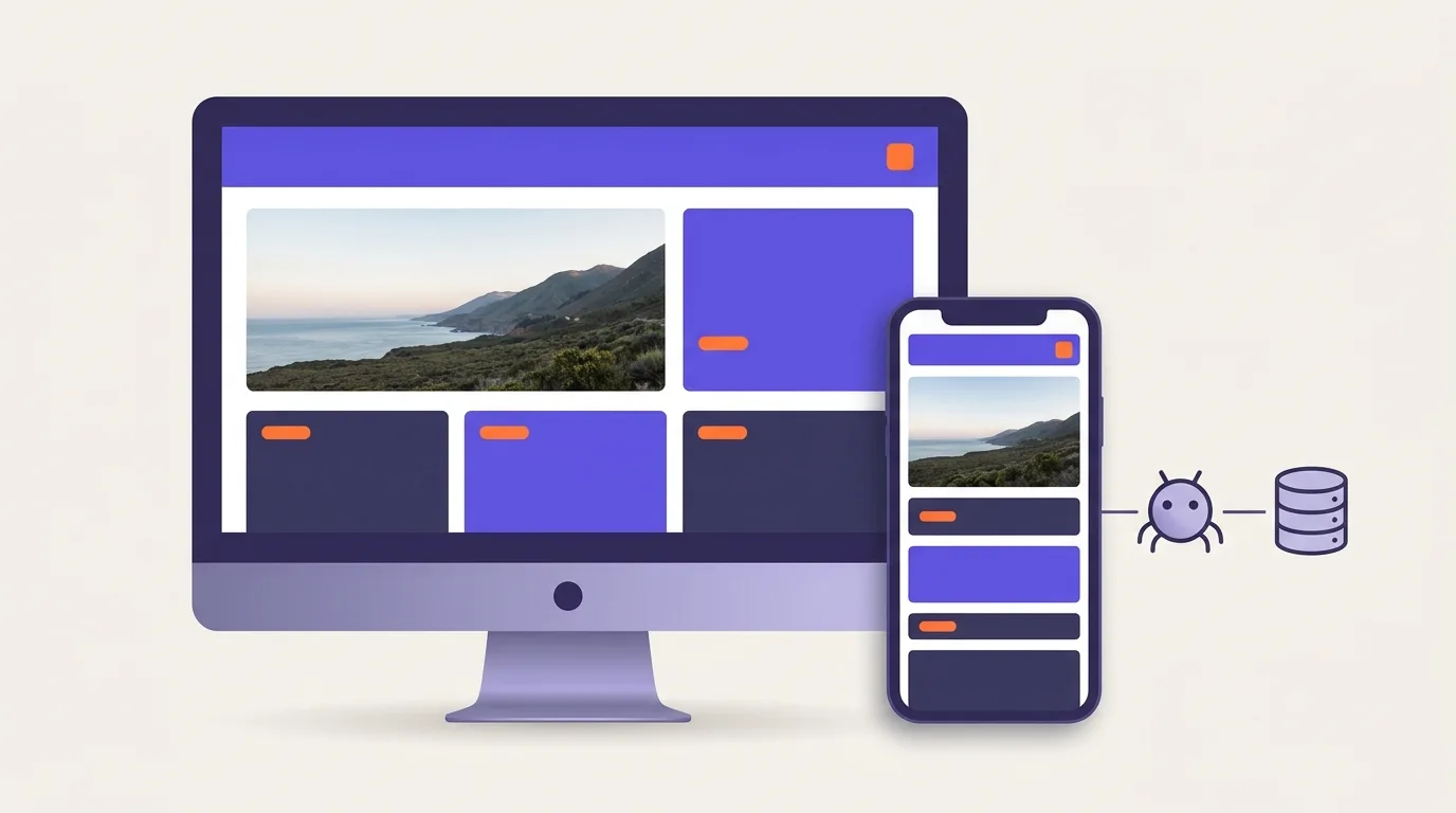
What is mobile-first indexing, and how does mobile optimization differ?
Mobile-first indexing and mobile optimization serve different goals. Mobile-first indexing means Google uses your site’s mobile content to index and rank pages. It gets that content through Googlebot Smartphone, its smartphone crawler (Google Search Central). Mobile optimization makes pages easier for people to read and use on small screens.
Mobile-first indexing does not mean Google has a separate mobile index. Nor does it require a separate mobile website. What matters is the content Google can access, not whether your site has a mobile web address.
Crawling, indexing, and ranking are how search engines find pages, organize their content, and choose results for a search.
Content access and usability are different checks
Content access means Google can load the information you want it to find. Usability means people can read that information and complete tasks on their devices.
A page can look good while key content stays out of Google’s reach. A page that Google can access may still have awkward menus or broken forms. Check both: what Google can load and what people can use.
Why does mobile content access matter for search visibility?
Content missing from your mobile page may not be available to Google for indexing and ranking (Google Search Central). Missing details can also stop people from completing tasks on their phones.
Mobile-first indexing is not an upcoming change you must opt into. After July 5, 2024, content that could not be accessed at all on mobile became ineligible for indexing (Google Search Central). This differs from a desktop-style page that still loads on a phone. An awkward layout alone does not mean a page cannot be indexed.
Keep the same core information on mobile and desktop. For example, shoppers need product details to check whether an item fits their needs. Removing those details on mobile can leave both users and Google with less information. The content parity checklist below explains what to keep and how to handle hidden panels.
For broader rules and checks, see indexability, noindex and index coverage.
Build a responsive layout without creating a separate content experience
Responsive web design lets a shared page fit different screen sizes. It serves the same HTML, or page code, at the same web address. The layout changes to fit the screen.
Google recommends this approach because it is the easiest design pattern to build and maintain. It is not a special ranking bonus (Google Search Central).
- Use flexible layouts. Let columns and images resize to fit the space. Avoid fixed widths that force users to scroll sideways across the page.
- Set the viewport. This setting tells the browser how to size the page for the screen. Match the device width and keep zoom enabled.
- Use CSS media queries. These style rules change the layout based on screen size. Adjust columns, spacing, and menus when content no longer fits well. You do not need a specific design framework.
- Test across devices and browsers. Try narrow screens, long text, and zoom. Turn the device sideways. A responsive theme does not replace these checks.
For ways to serve and compress images, see image optimization.
Dynamic serving sends different page code to each device type at the same address. Separate mobile URLs use different addresses for mobile pages. Responsive design does not need either approach.
If you already use separate mobile URLs, check the canonical relationships between mobile and desktop pages. These signals help show how the page versions relate.
How do you preserve mobile and desktop content parity?
Content parity means keeping the same core information on mobile and desktop. Google uses mobile content for indexing and ranking, so do not remove key details from that version (Google Search Central). Fonts, menus, and placement can differ. The information should still be there.
Content parity checklist
Compare the mobile and desktop pages for these items:
- Main text: Keep key explanations, limits, and supporting details.
- Clear headings: Keep useful labels for each topic.
- Product or service details: Keep features, scope, and terms.
- Useful media: Keep images and videos that help explain the content.
- Page titles and descriptions: Keep their meaning consistent across versions.
Showing loaded content versus loading it after a tap
Tabs and accordions can help organize a small screen. An accordion is a panel that opens to show more content. It is fine to use one for main content that has already loaded.
A button that loads key text only after a tap is different. Google does not tap, click, or swipe to load that content. Make sure it loads without those actions (Google Search Central).
For example, a desktop product page may list full details while mobile shows only a summary. Restore the missing details. You can place them in an accordion if they load with the page.
Use JavaScript rendering checks to see what content loads. JavaScript itself is not the problem; missing content is.
Keep structured data consistent across versions, too. This code describes your content to search engines. It should match what users can access.
Make essential mobile tasks work on small screens
Test whether visitors can find details, use controls, and finish key tasks on a small screen.
- Find information. Look for a price, product detail, or service term. Check for clipped text and content you cannot reach.
- Open and close controls. Use touch to test menus, accordions, and pop-up panels. Make sure they close and do not block key buttons.
- Complete a form. Enter realistic details and trigger error messages. Check that you can reach fields and submit the form while the on-screen keyboard is open.
- Reach the main action. Follow the task to its final step. Test with the device upright and sideways. Use a real device as well as a browser preview, which may miss device-specific faults.
Help people reach key pages through clear site navigation.
Leave enough space around touch controls and support zoom. Do not make features work only when a mouse hovers over them. These checks are part of web accessibility.
Use small promo banners instead of content-blocking interstitials, or full-page overlays. Google recommends small banners so people and search engines can reach the content right away (Google Search Central).
For each failure, note the device, screen direction, and task. Run the same test after the fix.
Common mistakes and outdated mobile SEO advice
Keep content access, ease of use, and speed separate in your checks. Avoid these common mistakes:
- Trusting a responsive theme without testing it. A theme may fit the screen yet leave out key details. Use the content parity checklist above.
- Requiring a special page format for mobile SEO. Google applies the same standards regardless of the technology used to build a page (Google Search Central). Focus on accessible content and working pages rather than a format mandate.
- Using retired tests. Google retired the Mobile-Friendly Test, its API, and Search Console’s Mobile Usability report beginning December 1, 2023 (Google Search Central). Use the current tools in the next section instead.
- Treating scores as proof of SEO success. A high Lighthouse or PageSpeed Insights score does not prove a page is indexed or will rank well. Use scores to help find issues, not to claim results.
Page speed optimization starts with finding what slows a page down. Follow that process rather than applying every speed tip to every site.
How can you check mobile access, usability, and results?
Test a sample of pages from each main layout, or template. Compare their content, inspect what Google can fetch, and try key tasks on real phones. Track issues and retest fixes. Traffic changes alone cannot show whether a mobile fix caused a result.
- Choose pages. Include key landing pages and layouts with different menus, forms, or other controls.
- Compare content. Use the content parity checklist above.
- Check what Google can fetch. Use URL Inspection to view page code and screenshots where available. A live test shows what Google can fetch now; it does not prove that version is indexed. See Google Search Console for tool guidance and ways to filter search performance by device.
- Test tasks. Try menus, forms, and purchase steps across browsers and screen sizes. Include real devices.
- Track fixes. Assign each open issue to someone. Retest it after the change.
Chrome DevTools lets you preview screen sizes. Lighthouse and PageSpeed Insights help find speed and page issues. Their reports are not a single pass-or-fail test for mobile SEO.
Core Web Vitals measure loading, response to user input, and layout shifts. The metrics are LCP, INP, and CLS. INP replaced FID on March 12, 2024 (web.dev). See Core Web Vitals for thresholds and help reading data from real visits.
Use a technical SEO audit for a broader site review.
Evidence checklist
Keep a test log with these details:
- The page and template tested
- What was missing or broken on mobile
- The task affected
- The person responsible for the fix
- What happened in the retest
Frequently asked questions
Is mobile-first design still relevant, and is it the same as mobile-first indexing?
Mobile-first design means planning for small screens first. It is still useful, but it is not the same as mobile-first indexing. Design is how you build the user experience. Indexing is Google’s process for handling content. Google uses mobile content for indexing and ranking (Google Search Central).
Do I need to resubmit my site to Google after fixing mobile issues?
You generally do not need to resubmit your whole site. Mobile fixes update existing pages. Google needs to crawl those pages again to see the changes. Use the access checks above to confirm that the fixed content loads.
How often should I retest mobile page templates?
Retest after changes to menus, layouts, scripts, forms, banners, or content loading. Add routine checks to your site maintenance plan. Check more often if the site changes often. Test pages from each main template, including those with lots of content. Do not rely only on your homepage.