
Quick answer: Calls to action (CTAs) are prompts that tell website visitors what to do next, such as downloading a guide, requesting a quote, or adding a product to a cart. Effective CTAs describe the next step clearly, appear where visitors are ready to act, and deliver the outcome their wording promises.
Key facts
- A button triggers an action, such as submitting a form or opening a dialog. Button Pattern | WAI-ARIA Authoring Practices Guide
- CTAs that navigate to another page should use an HTML anchor with an href containing a resolvable URL. Link best practices for Google
- Descriptive CTA link text is preferable to generic labels such as “Click here.” Link best practices for Google
- Sticky CTA bars must not entirely hide a component when it receives keyboard focus. Understanding Success Criterion 2.4.11: Focus Not Obscured (Minimum)
TL;DR: Choose a useful next step for the visitor, make the CTA’s promise explicit, and test whether it produces completed outcomes rather than just clicks.
- Call to action (CTA)
- A prompt that invites a visitor to take a specific next step through a link, button, or other actionable control.
- Primary CTA
- The most prominent invitation to complete the page’s main intended action.
- Secondary CTA
- A less prominent alternative for visitors who need a different next step before committing.
- CTA microcopy
- Short supporting text near a CTA that clarifies the commitment, conditions, or expected result.
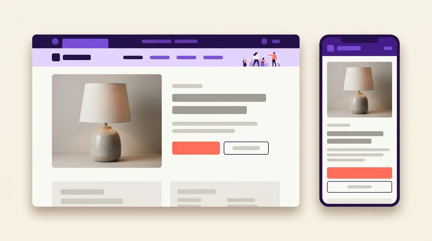
What are calls to action on a website?
Calls to action (CTAs) are website prompts that guide visitors toward a useful next step. In marketing, a call to action connects the content someone is viewing with an outcome, such as getting a resource, asking for a quote, joining a mailing list, or buying a product.
A CTA is a prompt, not a particular visual shape. A text link and a button can serve the same persuasive purpose while performing different functions. A link takes visitors to a destination. A button triggers an action, such as submitting a form or opening a dialog, as defined by W3C.
Useful CTA labels describe the outcome visitors can expect:
- Download the guide: get a resource.
- Request a quote: ask for pricing.
- Sign up for the newsletter: receive future updates.
- Add to cart: place an item in the shopping cart.
A contextual CTA follows from the content at hand: a service description might lead to a quote request. Broader site architecture and navigation helps visitors explore the site and find its main sections, rather than prompting an immediate next step.
Why do clear CTAs matter for UX and SEO?
Clear calls to action make the next step easy to recognize and show visitors what will happen before they act. They reduce uncertainty and help people move toward useful outcomes. For SEO, their value lies in serving organic visitors and, when implemented as crawlable links, helping search engines discover destinations.
Help visitors choose a useful next step
A useful next step fits the visitor’s task: an educational CTA might offer a buying guide, while a purchase-oriented CTA might lead to a product checkout.
Align the offer with search intent so it supports what the visitor came to do.
Better engagement, retention, and conversion are potential benefits to test, not outcomes to assume.
Separate conversion from search visibility
Conversion means completing a desired action; converting organic visitors is distinct from improving rankings. Do not treat CTA colors, click rates, or conversion rates as direct Google ranking factors.
For navigational CTAs, Google recommends an HTML anchor element with an href attribute containing a resolvable URL; script-only navigation cannot reliably be extracted as links, according to Google Search Central.
Choosing which pages to connect belongs to your broader internal-linking strategy.
Choose the next step and write a specific CTA
This section covers how to choose a useful next step and write calls to action that describe it clearly.
- Match the visitor’s task to the page’s outcome. A primary CTA is the main action: download a guide, book a demo, request a quote, or buy a product. Add a secondary CTA only when it offers a useful alternative, such as comparing plans before buying.
- Name the action and outcome. Google recommends descriptive, concise link text rather than generic wording such as “Click here” (Google Search Central).
| Generic label | Specific replacement |
|---|---|
| Click here | Download the checklist |
| Submit | Request a quote |
| Learn more | Compare subscription plans |
Keep labels concise, but do not impose a fixed word limit. Clarity comes first. “Start your trial” must start a trial, not unexpectedly open a sales-call request.
CTA microcopy is nearby text that explains relevant commitments. State payment requirements, subscription terms, or what happens after a request. Claims such as “free,” deadlines, and limited availability must be true, not persuasion tricks.
Trust signals provide broader evidence that helps visitors assess a site’s credibility.
Place CTAs where visitors have enough context
CTA placement matches the next step to the context visitors need before they can act.
Match placement to readiness
The primary CTA does not always belong above the fold—the area visible before scrolling. Choose its position based on what visitors already understand.
- Early: Show the action near the start when the offer and its value are already clear.
- In context: Place calls to action after product details, case studies, or useful article sections that support the decision.
- At the end: Add a prompt when reading the content helps visitors feel ready to act.
Make the main action distinct
Visual hierarchy makes the primary CTA easier to identify. Use deliberate prominence, whitespace, and separation from nearby controls. No color or shape is best for every page. On long pages, repeat the same primary action where useful, while keeping secondary CTAs visually subordinate.
A sticky CTA stays visible during scrolling; evaluate whether it helps without covering content. It is an option, not a mobile default.
For promotional prompts, prefer small banners to content-blocking intrusive interstitials, as Google recommends.
Make the CTA behave as promised
This section covers how calls to action should navigate, submit requests, and report outcomes accurately.
Match the element to the action
A link changes location; a button triggers an action.
Visit the quote page: <a href=”/request-quote/”>Request a quote</a> uses an HTML anchor element with an href attribute, as recommended by Google, rather than script-only navigation.
Submit the quote form: <button type=”submit”>Send quote request</button> uses a native HTML button element, matching W3C guidance.
A link can look like a button without changing its function. Broader rendering issues belong to JavaScript SEO.
Report the actual state
Feedback distinguishes activation from completion.
- Activation: Acknowledge input immediately, not success.
- Pending: Show “Sending request” while processing.
- Success: Confirm receipt only after it is confirmed; explain what happens next.
- Failure: Explain the problem, preserve entries where possible, and offer retry or another contact route.
Add a next-step link only when it helps, without distracting from confirmation.
Check usable interaction
Accessible CTAs require usable mobile tap targets and spacing, appropriate text contrast and control contrast, an accessible name containing the visible label, keyboard operation, and keyboard focus that sticky CTA bars do not entirely hide.
Common CTA mistakes to avoid
This section covers common calls to action mistakes and how to fix them without adding pressure or confusion.
- Vague labels: Replace “Click here” with wording that names the destination, such as “View delivery options”; Google recommends descriptive, concise link text and lists generic labels as poor examples (Google Search Central).
- Misleading promises: Make the offer match the outcome. False scarcity, hidden commitments, and pressure tactics mislead visitors; they are not effective optimization. State costs and conditions before visitors commit.
- Competing primary actions: Give the primary CTA clear priority. Multiple CTAs are not inherently wrong: unclear priority and conflicting decisions are the problem, not the raw count. Keep supporting choices distinct.
- Premature sales requests: Offer a useful next step, such as viewing product details, before asking visitors to buy or book.
- CTAs that blend in: Make the control easy to distinguish from surrounding content.
Changing a button color cannot make an irrelevant offer useful or repair a broken destination. Fix the offer and journey first.
A UX audit checks broader page-layout issues that may make actions hard to find or use.
How do you check and measure CTA effectiveness?
Check CTA effectiveness by testing the full journey on mobile and desktop, then measuring successful outcomes alongside clicks. Inspect the label, activate the control, verify the destination or submission, and confirm the resulting feedback. Use focused experiments to assess whether clearer wording, placement, or presentation helps visitors complete the intended task.
Measure activation and completion separately
CTA measurement connects a specific prompt with its intended conversion, not just its activation.
- Record a stable CTA identifier, page, placement, clicks, and confirmed downstream outcomes.
- Define CTA click rate as clicks divided by either tracked CTA exposures or eligible page views. State which denominator you use; do not compare rates with different definitions.
- Evaluate completed purchases, successful requests, or other intended outcomes alongside clicks so curiosity clicks do not count as success.
For implementation and broader context, see analytics setup and user engagement metrics.
Test a focused hypothesis
An A/B test compares randomly allocated variants against a predefined outcome.
State a hypothesis about clarity or relevance. Change wording, placement, or presentation—not styling without a reason. Require sufficient evidence rather than declaring a winner from a brief fluctuation; use careful data analysis.
Heatmaps offer supplementary interaction clues, not proof of visitor motivation or causal improvement.
Frequently asked questions
Can a phone number or email address be a call to action?
A phone number or email address can be a call to action when it clearly invites contact. Pair it with wording such as “Call to book” or “Email us for a quote” so visitors know what to do and why. Make the contact detail actionable where practical, and keep it visible for people who prefer to copy it.
Should a CTA link open in a new tab?
A CTA link takes visitors to a destination; opening a new tab should be a deliberate exception, not the default. Prefer the same tab for normal journeys through your site. Consider a new tab when visitors need to keep an unfinished task open, and warn them in the link wording. Let visitors choose a new tab themselves whenever practical.
Should CTA wording change when a website is translated?
Translated CTA wording should preserve the intended action, not necessarily the original words. Adapt the label to local language, tone, and expectations while keeping the next step clear. Ask a fluent reviewer to check that it sounds natural and matches the destination. Check the translated label in the layout, and avoid shortening it so much that its meaning becomes unclear.
Is “Buy now” or “Add to cart” the right label for a product CTA?
A product CTA label describes the action the control performs. Use “Add to cart” when it adds the item to a cart without taking the shopper straight to checkout. Use “Buy now” when it starts a direct purchase flow. Neither label is always better. Match the wording to the actual next step, and make any final payment action explicit.
Sources
- Button Pattern | WAI-ARIA Authoring Practices Guide
- Link best practices for Google
- Avoid intrusive interstitials and dialogs
- Understanding Success Criterion 2.5.8: Target Size (Minimum)
- Understanding Success Criterion 1.4.3: Contrast (Minimum)
- Understanding Success Criterion 1.4.11: Non-text Contrast
- Understanding Success Criterion 2.5.3: Label in Name
- Understanding Success Criterion 2.4.11: Focus Not Obscured (Minimum)