

Updated October 31, 2026 · By RAMRAD · Reviewed by Robin Rad
The WebAIM Contrast Checker tests foreground and background color pairs against WCAG contrast rules. During a website audit, use it to find text that’s hard to read and test color changes. Check your fixes with it, too, but don’t take a passing result as proof that the whole site is accessible.
Enter your colors, read the contrast ratio, and check the results for normal and large text. Compare WCAG Level AA with Level AAA, and include non-text contrast in your review. You’ll need to account for what a contrast check misses rather than relying on the result alone.
Make page testing repeatable by recording your findings so you can check changes later. Pair accessibility checks with broader SEO reviews without treating them as the same task. For the SEO side of your audit, explore Deep SEO’s AI SEO platform.
What does the WebAIM Contrast Checker check?
The official WebAIM Contrast Checker checks whether a color pair meets WCAG text-contrast rules for normal or large text. You’re testing the pair you enter, not auditing an entire website, so read the pass results as an answer about those colors rather than the whole page.

Understand the colors and ratio
Your text uses the foreground color; the color directly behind it is the background color. If you’re checking a button label, compare its text color with the button fill—not the surrounding page.
The contrast ratio comes from the colors’ relative luminance: light intensity weighted for human vision, rather than a simple brightness difference. Higher ratios mean greater contrast. Use the actual colors on your page in the WebAIM Contrast Checker to calculate the ratio.
Read the text-size and conformance results
For the thresholds and text-size definitions, see “What contrast ratios pass WCAG AA and AAA?” below.
How do you use the WebAIM Contrast Checker?
Start with the colors shown on your live page, not just your design file. Enter the text and background colors into the checker. If the pair fails, change a color and retest it before checking the change on your website.
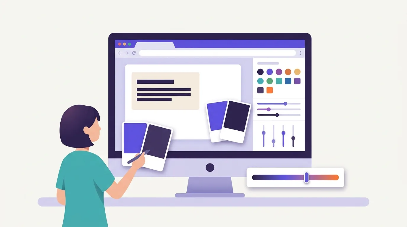
Inspect the live page first
Use Chrome DevTools or your browser’s developer tools to inspect the text. Record these properties:
- Foreground color
- Background color
- Font size
- Font weight
Check the live styles rather than assuming they match your design file.
Open the checker and find its color inputs. Enter the foreground and background colors you recorded.
Read the applicable result
Refer to the comparison section below for the result that applies to your text.
Adjust the colors and record the result
If the pair fails, try darkening the foreground or lightening the background. Enter the new pair and check the result again. Record the checker’s output, not an estimated ratio.
Apply the change, then inspect the live colors again. Keep contrast findings alongside broader audit tasks when you explore AI SEO Audit.
What contrast ratios pass WCAG AA and AAA?
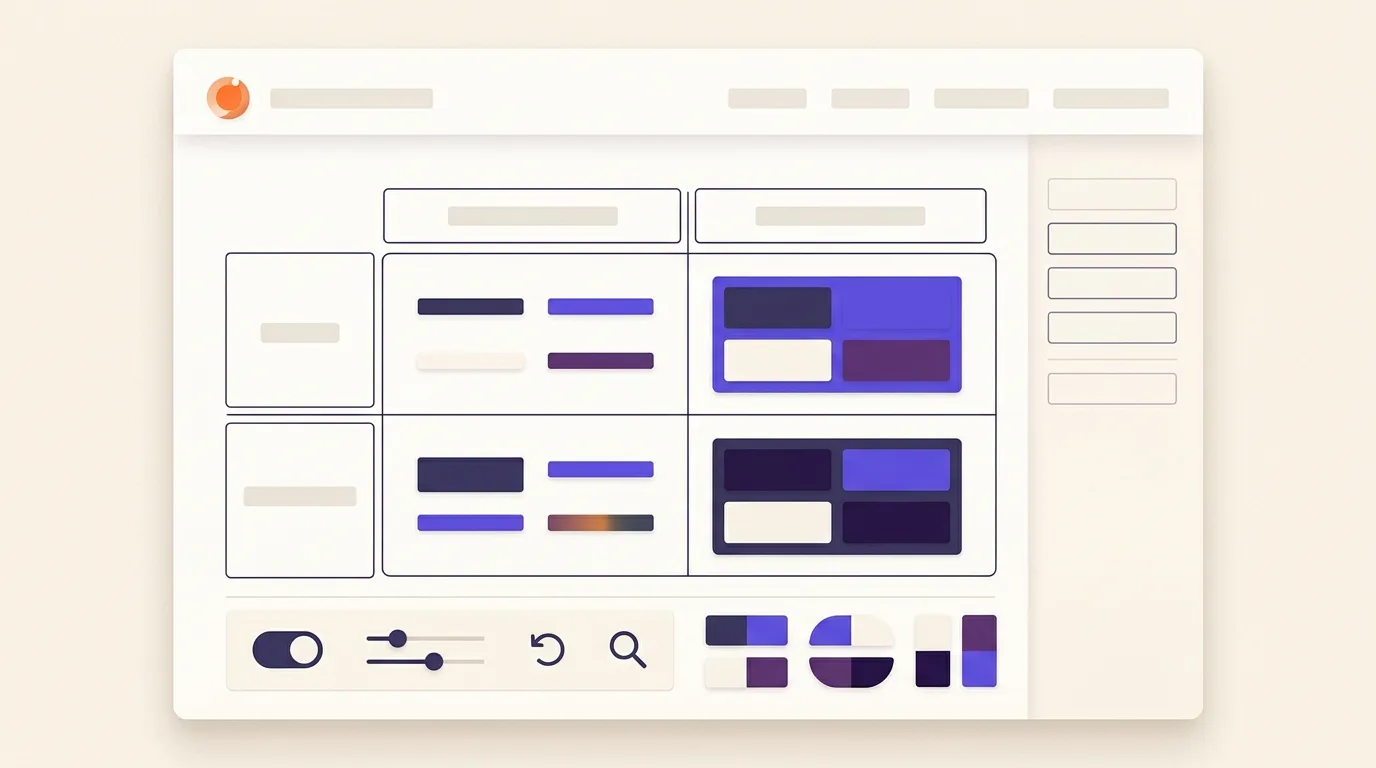
WCAG Level AAA requires higher text contrast than Level AA, and the minimum ratio depends on whether your text counts as large or normal. Compare the minimum ratios in the table below with those shown by the WebAIM Contrast Checker.
Large text starts at 18 points (typically 24 pixels), according to WebAIM. For bold text, the minimum is 14 points (typically 18.66 pixels). Smaller text uses the normal-text thresholds, so check the font size and weight on your live page. A heading doesn’t count as large text just because it looks prominent.
| Text category | Level AA minimum | Level AAA minimum |
|---|---|---|
| Normal text | 4.5:1 — WebAIM | 7:1 — WebAIM |
| Large text | 3:1 — WebAIM | 4.5:1 — WebAIM |
Keep non-text contrast separate
WCAG 2.2 Success Criterion 1.4.11 sets a separate minimum of 3:1 against adjacent colors, with specified exceptions. That requirement covers visual information needed to identify controls and their states, or to understand graphics—not text, so don’t apply text-size categories here.
For non-text contrast, 2.999:1 fails the 3:1 requirement. According to W3C, you must not round calculated ratios up to pass. If the ratio falls short, adjust the colors rather than treating a near-pass as a pass.
Why prioritize contrast in a website audit?
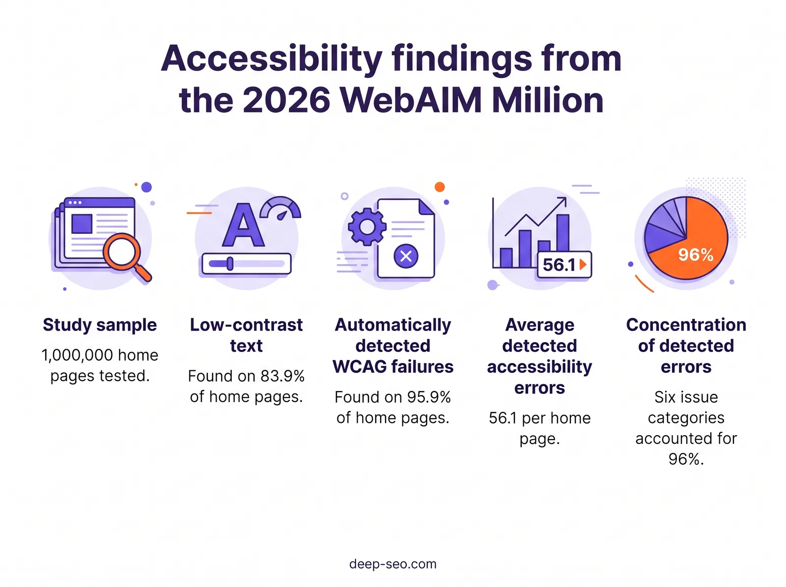
Prioritize contrast because it affects how easily visitors can read your content and gives you a clear issue to investigate in an audit. The 2026 WebAIM Million study found low-contrast text on 83.9% of tested home pages, up from 79.1% in 2025 (WebAIM Million).
Those findings come from 1,000,000 home pages (WebAIM Million), not every page on those sites or the entire web. They show a widespread problem within that sample, but they aren’t a diagnosis of your website.
Put contrast in the wider accessibility picture
In February 2026, 95.9% of home pages in the sample had automatically detected WCAG failures (WebAIM Million). Don’t read that as a contrast figure: it covers accessibility failures in general.
The study also found an average of 56.1 detected accessibility errors per home page (WebAIM Million). Those weren’t all contrast issues, so fixing text colors should be part of your accessibility work rather than a replacement for other checks.
Use the findings to set priorities
Start with content visitors need to read or act on. Check instructions carefully, and pay particular attention to form labels and button text. Check shared styles too, because a color choice may appear across several page templates. Record where each issue occurs so your team can check fixes in context.
Curious how your own site does? Run the free website check and RamradOS, our AI SEO assistant, picks it up from there. Start the free check →
What does a contrast check miss?
A contrast check won’t tell you whether images have useful alternative text or forms have labels. Clear control names and document language sit outside its scope, as do barriers to using your site. W3C states that no single tool can determine whether a website meets accessibility standards; knowledgeable human review is required.
Look beyond color pairs
The WebAIM Million study tracks several common issues that a contrast check won’t catch:
- Missing image alternative text.
- Missing form labels.
- Empty links.
- Empty buttons.
- Missing document language.
Along with low-contrast text, these six categories account for 96% of errors detected in the 2026 WebAIM Million study.
Don’t treat that list as a complete accessibility checklist. A tool may find alternative text or a label, but a person still needs to judge whether it’s useful and clear.
Add human review to the audit
Pair your automated checks with skilled accessibility review. The tasks below belong in a broader website audit; they’re not WebAIM Contrast Checker features.
Keyboard use: Check whether visitors can reach and use menus without a mouse. Test forms and other controls the same way.
Focus behavior: Check that keyboard focus stays visible and follows a sensible order. When dialogs open or close, does focus move to the right place?
Assistive-technology review: Assess how content and control names are conveyed during real tasks. Check how status changes are conveyed, too.
A clean tool report doesn’t establish legal compliance or full WCAG conformance. Record what you tested and what remains unchecked, then identify which findings need human review.
A repeatable contrast-testing workflow for website audits
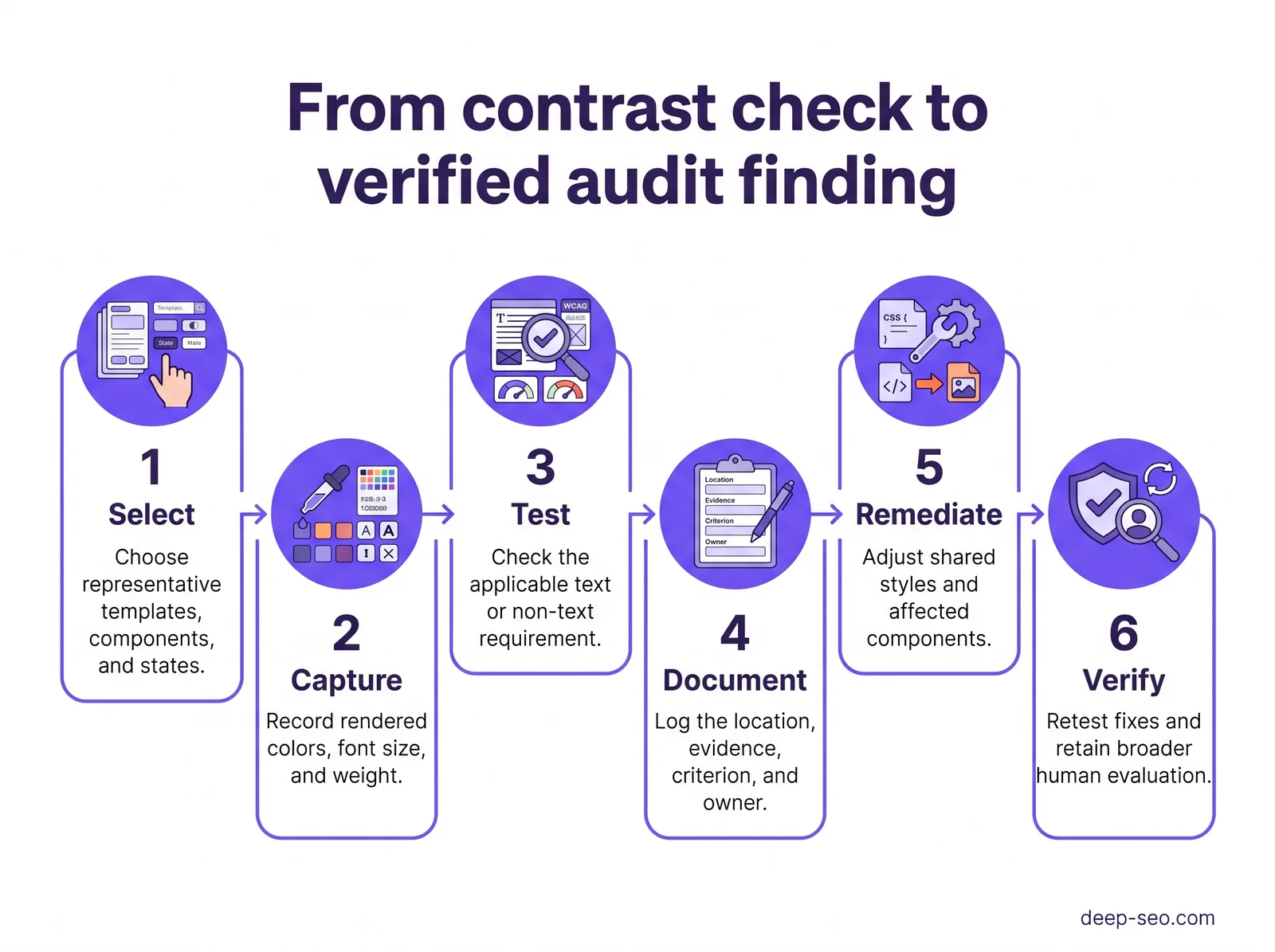
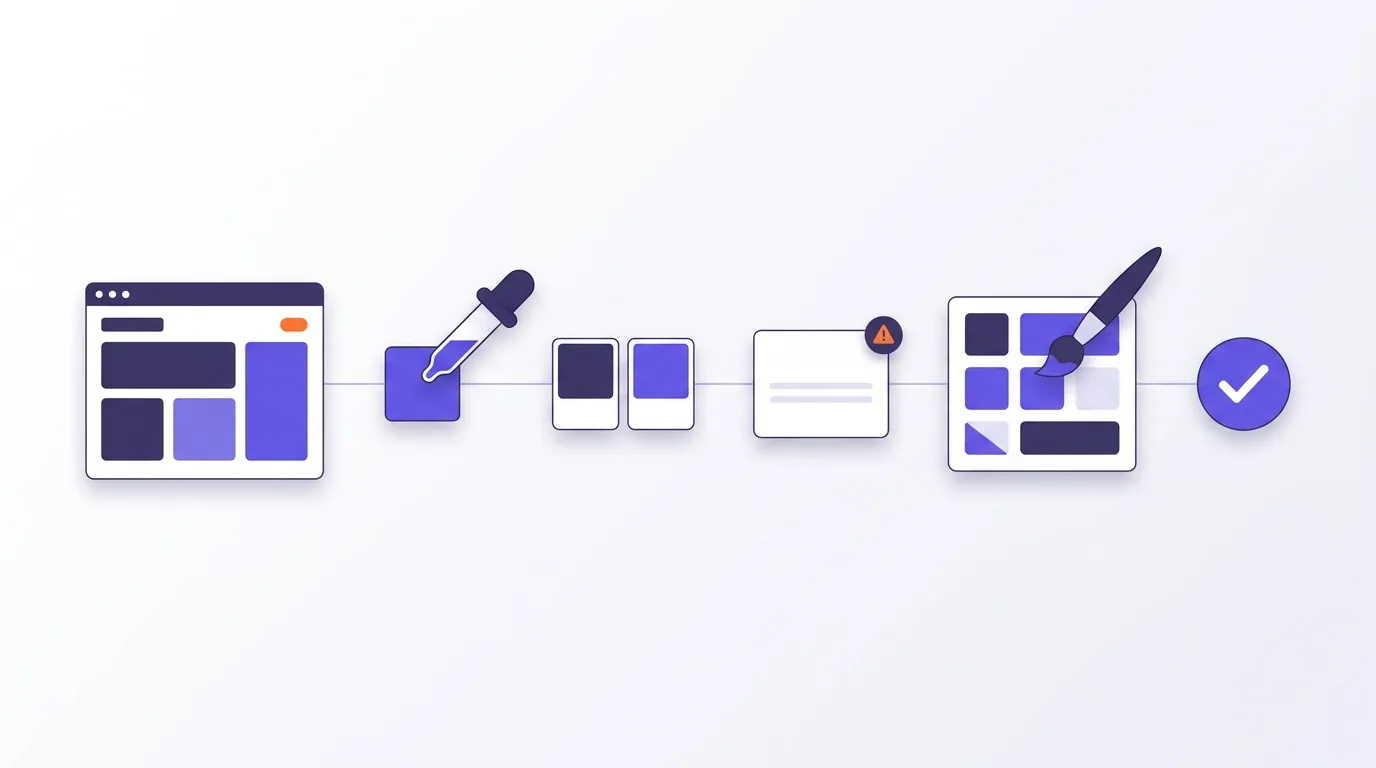
Workflow at a glance: Select templates and states → capture colors → test → log issues → fix shared styles → verify.
Test reusable components across templates
- Select sample pages. Don’t stop at the home page. Your sample should cover:
- Navigation
- Body copy
- Forms
- Calls to action
Include these states where needed:
- Hover
- Focus
- Error
- Selected
- Capture live colors. Inspect each selected state in Chrome DevTools using the color-pair method above. Check backgrounds that change across templates.
- Apply the right requirement. Refer back to the comparison section for AA and AAA requirements, or non-text requirements where applicable.
- Log each issue. Record enough detail to identify and fix it:
- Page
- Component
- State
- Color pair
- Font size and weight
- Relevant rule
- Observed result
- Proposed fix
- Fix shared styles. Prioritize essential tasks and widely reused components, considering user impact as you decide what to fix first. Treat this as practical audit guidance—not a ranking formula or a WebAIM study conclusion.
- Verify changes. Retest affected templates and states with the WebAIM Contrast Checker. Record your results, then check whether the changes introduced new issues.
Keep human review distinct
For the scope of human review, refer back to “What does a contrast check miss?”
For separate SEO checks, see what AI SEO Audit covers.
How do accessibility checks fit alongside an SEO checker?
Accessibility checks belong alongside an SEO checker in your website audit because they answer different questions. Treat color-pair testing as a separate task from broader accessibility review, and keep SEO review distinct from both. Bring the findings into a shared action plan, but don’t treat any tool as proof that the whole site works well.

Keep each audit scope clear
For the limits of color-pair testing, refer back to “What does a contrast check miss?”
Your SEO review covers:
- Crawlability
- Indexing
- Page structure
- Content
A contrast result tells you nothing about those checks. The reverse is true, too: an SEO checker’s findings don’t establish whether people can use your site.
SEO optimization tips for a shared audit
- Keep evidence separate. Record which component and state each contrast finding affects. Crawl findings or content notes belong with their own search issues, not with the accessibility evidence.
- Name an owner. Assign accessibility fixes to the relevant designer, developer, or editor. For search issues, choose the owner based on the work needed.
- Define completion checks. Check accessibility fixes against the relevant rules and human tests. For each search fix, check whether it addresses the specific issue you recorded.
You can explore Deep SEO’s AI SEO platform for the SEO side of this work. To coordinate related changes, use a shared task list while keeping the evidence and completion checks separate.
Turn contrast findings into a broader audit action plan
Turn findings into assigned work, not just a list of failed color pairs. Keep evidence with retest results, as outlined in the workflow, so each issue has a clear path to closure.
Use a compact handoff checklist
- Evidence: Record the page and component, including the relevant state. Add the text and background colors alongside the contrast result.
- Relevant criteria: Name the WCAG criterion and text category, or note the non-text rule that applies.
- Fix owner: Assign the fix to someone responsible for the shared color setting or component. For page-level fixes, name the page style owner. Note any work that must happen first.
- Completion checks: Define the required result and the states and templates that must pass a retest.
- Status: Mark the issue as awaiting a fix, awaiting retest, or verified. Attach evidence from the updated page.
Connect the backlogs without merging their goals
Link contrast tickets to related SEO work when they affect the same page or release. Keep their completion checks separate. Contrast fixes need checks against accessibility rules. SEO tasks need tests suited to their stated search goal.
A completed SEO task should not close an accessibility issue, or vice versa. Shared ownership can help teams plan releases without treating either review as a substitute.
To explore the SEO side, consider Deep SEO’s AI SEO Audit. Read the product page to confirm its current scope before deciding whether it fits your needs.
Frequently asked questions
Should light mode and dark mode have separate contrast test records?
Yes. Each mode uses different text and background colors, so keep separate records. For each test, record:
- The mode
- The page or component
- The color pair
- The result
Include hover and focus states where colors change. Link the related records so your team can check both modes when updating shared styles.
How should contrast be evaluated when text sits over a photograph or gradient?
Test the background directly behind the text, starting with the areas where contrast is weakest. An average background color isn’t enough. Check relevant image crops and screen sizes because they can change what sits behind each letter. If you need a solid text panel or overlay, add it and retest the final design.
What can a team change when its brand colors cannot be replaced?
You can change where the colors appear without replacing the palette. Keep brand colors in decorative areas and use a higher-contrast pair for text. A solid background panel or a different text color may be enough.
If changing text size is an option, refer back to the comparison section.
Who should own contrast remediation across your team?
Give one named owner responsibility for coordinating fixes, but share the work across roles. Designers should define color pairs and states that meet the relevant rules; developers should build those choices into working pages and test them there. Content editors should stick to approved color pairs and check text placed over images. Don’t close an issue until it’s been retested.
What contrast-testing evidence should a client request from an agency?
Ask your agency for a test log covering:
- Pages and components
- Modes and states
- Sampled colors and contrast ratios
- Pass or fail results
Request screenshots with the target accessibility level, too. You’ll also need a record of unresolved issues and evidence of retesting after fixes.
For human checks to request alongside the tool output, refer back to “What does a contrast check miss?”
Key takeaways
- Be clear about scope. WebAIM Contrast Checker findings give you evidence for contrast decisions. They aren’t a verdict on overall accessibility.
- Fix shared issues first. Follow the workflow above to tackle recurring color issues before isolated cases, and check that your changes still fit your brand.
- Keep human review involved. Ask reviewers to work through real tasks, especially when tool findings leave ease-of-use questions unanswered.
- Don’t close issues without checking. Keep the evidence and retest results, but only close an issue after someone reviews the updated page in context.
Bring your contrast findings and SEO checker results to the same planning session so you can assign owners and agree on when to check the fixes.
See what this means for your website
Start with the free check. RamradOS explains the results and, if it fits, our AI SEO Audit goes deeper.
Check your website free — in one minute
Our AI platform reviews your site and shows what to fix first. Our SEO team can implement it for you.