
Quick answer: Site architecture and navigation organize a website’s content and the routes people use to reach it. Architecture defines relationships among pages; navigation exposes those relationships through menus, category pages, breadcrumbs, and other links. A clear structure helps visitors find information and helps search engines discover pages and understand their relative importance.
Key facts
- Google generally infers site structure and page importance from links, not URL folders. Help Google understand your ecommerce website structure
- Reliable crawlable links generally use an HTML <a> element with an href attribute. Link best practices for Google
- Google recommends linking to every important page from at least one other page on the site. Link best practices for Google
- Google began removing breadcrumbs from mobile search results in January 2025; desktop display and structured-data support remain. Simplifying the visible URL element on mobile search results
TL;DR: Map content around users’ tasks, connect important pages through clear navigation, and validate the routes with user testing and a site crawl.
- Site architecture
- The organization of a website’s pages and the relationships that connect them.
- Navigation
- The menus, links, and controls visitors use to move between pages and find content.
- Breadcrumb navigation
- A secondary trail of links showing a page’s place within a meaningful site hierarchy.
- Click depth
- The minimum number of link-following steps needed to reach a page from a specified starting page.
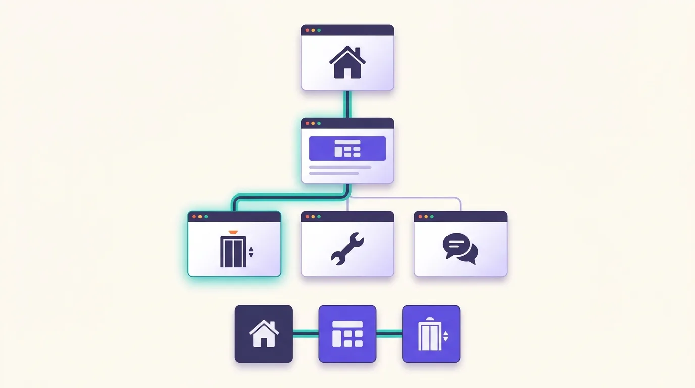
What is site architecture and navigation?
Site architecture and navigation define how your website groups content and helps people reach it. Architecture sets the links between broad categories and specific pages. Navigation makes those links visible through menus and other routes. A menu is only part of the structure.
Content organization and visible routes
Information architecture is how you organize content. A hierarchy moves from broad topics to specific pages. Parent categories group related content; category landing pages explain each group and link to its pages. Related branches can connect too, so not every site needs a rigid tree.
For an elevator service business, a route could be Home → Services → Elevator Maintenance. Services is the parent category and landing page. Installation and Consulting are sibling services. The main menu links to Services, while a breadcrumb trail shows where the maintenance page sits.
Google generally infers site structure and page importance from links between pages, not URL structure, according to Google Search Central.
Readable URL design helps users. Google Search Central recommends simple URLs with descriptive words, but URL folders can’t replace links between pages.
Why does clear architecture matter for users and SEO?
Clear architecture makes related content easier to find. Visitors can compare services or return to the service overview without guessing where to go. For SEO, links help Google understand how those pages relate, as explained in Google’s site structure guidance.
Help visitors complete connected tasks
Group broad topics above specific services so visitors have a clear path to the detail they need.
- Find a service: A clearly named maintenance category leads to the service page.
- Compare services: Category landing pages bring related options together so visitors can check which fits their needs.
- Return to the overview: A visible parent link lets visitors step back without starting again.
These routes can reduce confusion when visitors land on a service page rather than your homepage.
Support discovery without overstating results
Prominent categories give you a clear place to link related service pages.
Search engines discover pages through crawling and may then index them, but finding a page doesn’t ensure it will appear in search results.
Clearer architecture can support discovery and ease of use. Search visibility depends on more than navigation, including whether your content meets the query and whether search engines can access it.
Plan categories around users’ tasks
Build categories around what visitors need to do, not just how your business names its teams. If someone wants to book maintenance, they shouldn’t need to know which department provides it.
- List content and priority tasks. Record your existing pages. Then list what visitors need to do, such as book maintenance or compare services. Mark pages that need a clear place in navigation. A content audit can help you decide which pages to keep and what needs to change.
- Group related pages. Build categories around those tasks. Map each category landing page and the pages beneath it. A Services page could link to Maintenance and Installation, for example.
- Explore users’ groupings. In card sorting, you ask users to group content labels and name the groups. Compare their choices with your planned categories. Look closely at labels or pages that people place in different groups.
- Test findability. In tree testing, users try to find pages in a text-only hierarchy. Give them a real task, such as finding installation options. Revise branches where people take wrong turns.
- Refine labels and routes. Choose short, familiar labels that describe the page they lead to. “Our Services” and “Get in Touch” aren’t always clearer than “Services” and “Contact.” Keep key routes direct, but don’t assume every page belongs in the main menu or needs a fixed click-depth limit.
Use keyword mapping to match target queries to suitable pages.
Build navigation that exposes the hierarchy
Use the main menu for your primary destinations. Put links to more specific pages within their sections, so the header doesn’t have to carry every route.
| Navigation route | Main job |
|---|---|
| Global navigation | Lead to primary destinations across the site. |
| Local navigation | Connect nearby content within the current section. |
| Category landing pages | Introduce a topic and link to its child pages. |
| Footer navigation | Group utility links, such as contact details and policies. |
| Internal site search | Offer another route, not the only path to important content. |
Choose menu types based on visitor tasks. A mega menu may suit a broad catalog; a simpler site may not need one. Test mobile menus and sticky headers in use. Keep the menu entrance easy to find on small screens, even if the layout differs from desktop.
Keep labels familiar across page templates. Repeated navigation should stay in the same relative order unless the user initiates a change, as described by W3C.
Give every important page an incoming internal link from another page on your site. Use concise, relevant link text that describes the destination, following Google Search Central guidance.
For reliable crawling, page links should generally use an HTML <a> element with an href attribute. That applies to links added with JavaScript too, per Google Search Central. See JavaScript SEO and rendering for details.
Test the menu with a keyboard as well as touch or a mouse. Pay particular attention to these checks:
- Keyboard operation: You should be able to open menus, follow links and close menus without a mouse.
- Visible focus: You should be able to see which control has keyboard focus.
- Pointer targets: WCAG 2.2 Level AA sets a minimum size of 24 by 24 CSS pixels. Exceptions cover sufficient spacing, equivalent controls, inline targets, unmodified browser controls and essential presentations. Check the conditions in W3C’s target-size guidance before relying on an exception.
- Unobscured focus: Sticky headers, footers or other content you add must not completely hide a control when it receives keyboard focus, under W3C’s focus-not-obscured requirement.
Use the web accessibility guidance for implementation details.
Use breadcrumbs to show location and parent routes
Breadcrumb navigation is a secondary trail that shows a page’s place in the hierarchy. Use it when visitors need a clear route from a deeper page back to its parent categories.
Someone who lands directly on an elevator maintenance page can use the trail to reach Services without retracing their visit.
- Link parent pages and identify the current page. For example: Home → Services → Elevator Maintenance. Link Home and Services to those pages. Make it clear that Elevator Maintenance is the current page.
- Use a meaningful hierarchy. Show a typical user path, not browsing history or a copy of URL folders, as recommended by Google Search Central.
- Make the trail easy to notice. Placement near the page heading can work for this service page. Keep the main navigation too, because breadcrumbs don’t show every main destination.
Google no longer shows breadcrumbs in mobile search results. It still shows them on desktop and supports breadcrumb structured data, according to Google Search Central. The trail on your page still serves visitors.
SERP features are search-result displays, separate from navigation on your site.
Breadcrumb markup describes the trail for search engines. See structured data for implementation guidance.
Avoid common architecture and navigation mistakes
A tidy menu can still leave important pages hard to find. Check the routes beyond the header, especially links from category pages.
- Rigid layout rules. Avoid fixed menu-item counts and universal click-depth limits. Too much nesting hides useful pages behind layers. Too little can create crowded lists. Make key pages easy to reach without putting every link in the header.
- Unclear choices. Look for vague labels and categories that overlap without a clear reason. Crowded dropdowns can make choices harder to scan. Hidden menus may leave visitors unsure where to start.
- Inconsistent routes. Check for unexpected changes in menu order or labels across related pages. Those changes can force visitors to learn the menu again.
- Search-only destinations. A service page missing from category pages may be hidden unless visitors know what to type in site search. Follow the internal-link guidance above.
XML sitemaps support discovery but don’t replace usable linked routes.
Check that links reach the intended page. Use the guide to redirects and broken links to diagnose and fix problems.
How can you check whether navigation works?
Ask users to find key pages. Start some tasks on the homepage and others on deeper pages. Use what you observe in a UX audit, then repeat the tasks after changes.
- Observe task completion. Record whether users finish each task and where they first choose to go. Watch for pauses or backtracking, and ask users to explain their choices. Compare what happens before and after changes.
- Check reachability. Crawl from the homepage. Compare the pages the crawl finds with your content inventory. Investigate missing pages and broken links. Check whether priority pages sit deeper than you intended. A crawl may miss unlinked pages, so you need the inventory to spot gaps.
- Test actual mobile routes. Use the mobile menu and category pages on a small screen. A desktop hierarchy diagram won’t show whether those routes are usable.
- Prioritize observed problems. Review site search queries, especially searches that return no useful result. Combine those clues with observed menu use and user feedback. Heatmaps can show activity, but they don’t explain intent.
Click tracking and path reports can support diagnosis. See Google Analytics 4 for setup.
Exits or bounce rates alone don’t prove that navigation failed or affected rankings. See user engagement metrics for context.
Change a specific route or label and retest the same tasks. Check that important pages are still reachable.
Frequently asked questions
Can the same page belong to more than one navigation category?
Yes, when each placement fits a visitor’s task. Link each category to the same page URL rather than creating duplicate pages. Choose labels that describe what visitors will find. Don’t add unrelated category links just to make a page more visible.
Does reorganizing navigation require changing page URLs?
No. You can regroup pages or change menu labels while keeping existing URLs. Google generally infers site structure from links rather than URLs, according to Google Search Central. Treat URL changes as a separate decision, not an automatic part of a navigation redesign.
Do small websites need an internal search box?
Not always. A small site may offer enough routes through clear menus and contextual links. Accessibility guidance calls for multiple ways to find pages, except for pages that are steps in a process or its results. It doesn’t require search specifically; see W3C guidance. Consider search when visitors struggle to find content by browsing.
Should navigation change for logged-in users?
It can, because account holders may need routes to orders or settings. Keep shared labels and core routes familiar, and make account controls easy to find. Repeated navigation should retain its relative order unless the user initiates a change, as explained in W3C guidance.
Sources
- Help Google understand your ecommerce website structure
- URL structure best practices for Google Search
- Understanding Success Criterion 3.2.3: Consistent Navigation
- Link best practices for Google
- Understanding Success Criterion 2.5.8: Target Size (Minimum)
- Understanding Success Criterion 2.4.11: Focus Not Obscured (Minimum)
- Breadcrumb (BreadcrumbList) structured data
- Simplifying the visible URL element on mobile search results
- Understanding Success Criterion 2.4.5: Multiple Ways